Empire Legal
Empire Legal is a conveyancing firm that expanded quickly from a small initial team. They wanted a brand representing the friendly and kind approach they offer to their clients, their transparency, and their overall top-quality customer service.
I created a fun look that still referred to their excellent work ethic and transparency.
Project’s creative direction and intellectual property: Digital Bloom.
Project’s creative direction and intellectual property: Digital Bloom.
For the logo, I chose a sans serif font that felt clear and timeless, as well as lower case letters that gave it a more versatile and young look while still expressing stability and trustworthiness.
For the submark, the client requested an icon representing the brand while also expressing connection. As a result, the "e" design shows as an interconnecting line moving from one point to another.
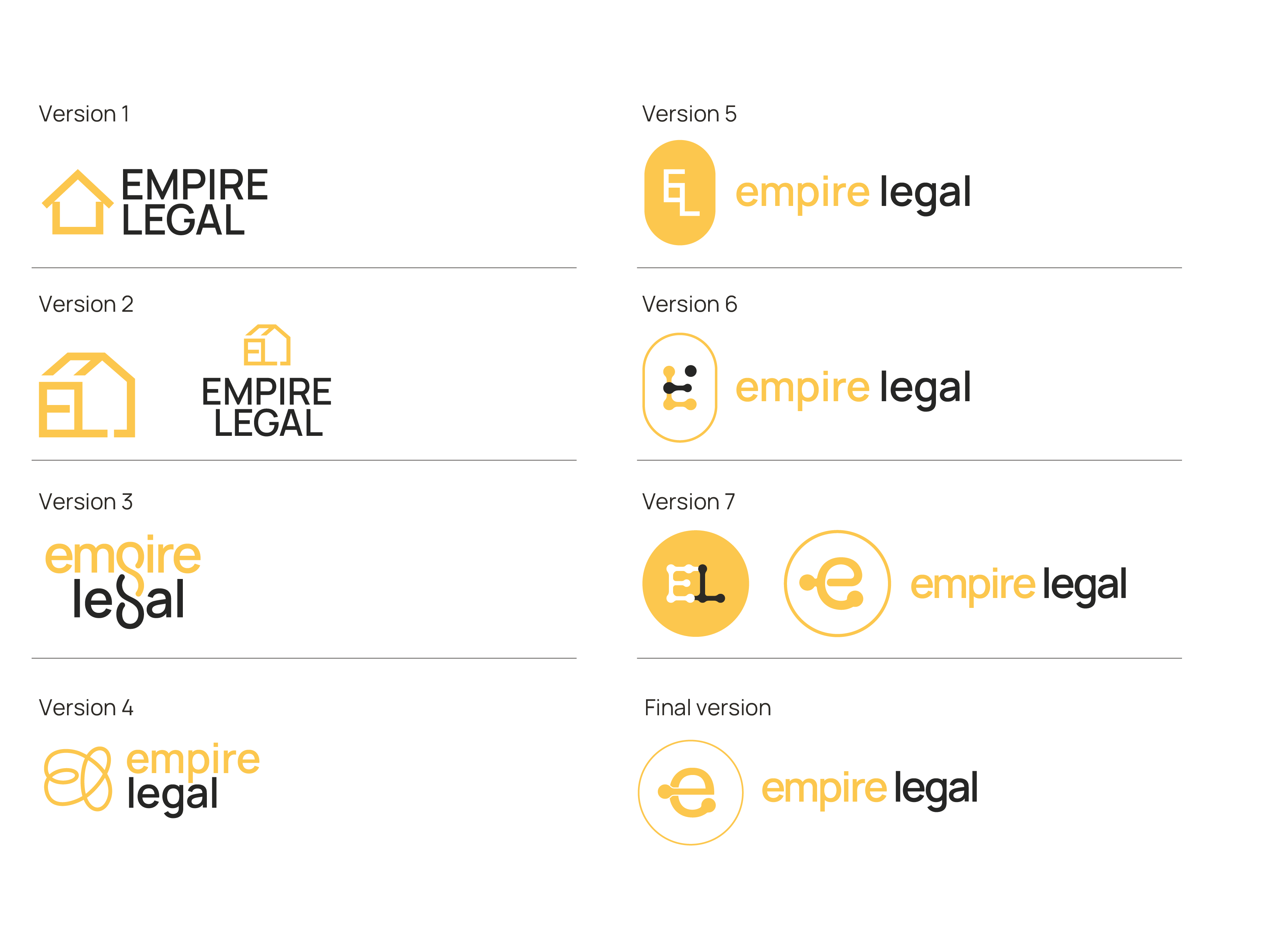 After creating logo proposals related to the client's work in conveyancing, they realized they didn't want their brand to focus solely on this aspect since they were thinking of expanding. The focus shifted to the brand's purpose: connection. The wordmark remained mostly unaltered as we explored different possibilities to represent this new brand image.
The original color palette was just yellow and black. I added white and lighter tones to make the compositions brighter and easier on the eye, smoothing out the strong contrast between the two former colors.
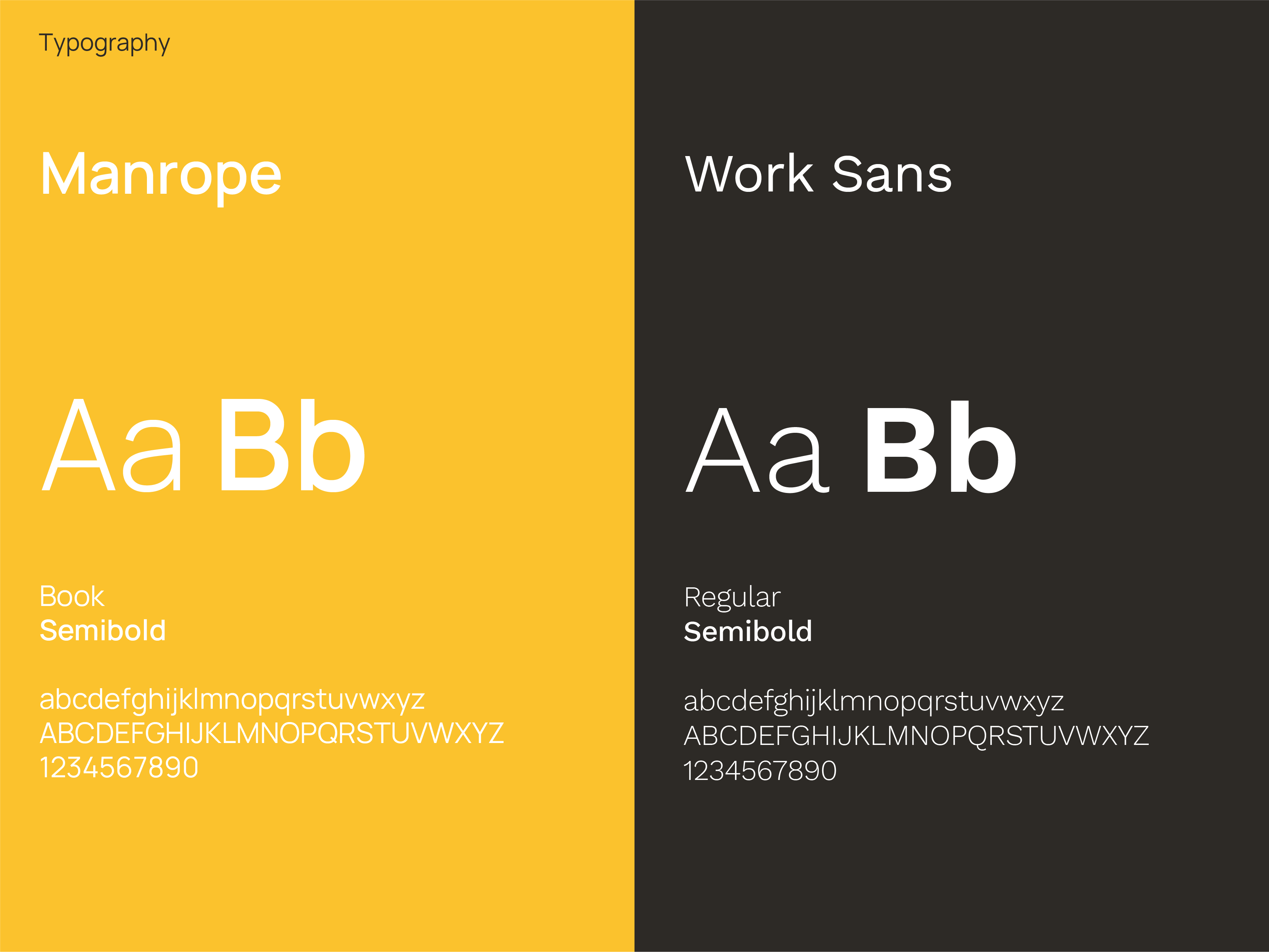
To complement the main font, Manrope, I chose Work Sans. They look well together because they share the same proportions, and while Manrope is best used for headlines and subtitles, Work Sans was selected as the font for the most extensive portions of text.
I illustrated these icons as an expansion of the brand's visual language. They were created following the idea of making the brand appear more approachable and friendly. Some illustrations respond to the brand's aspects discussed with the client. For example, the speech bubbles represent Empire Legal's open and honest communication with their clients, and the sailing boat expresses how Empire Legal turns real estate into smooth sailing.
These icons were applied to social media and web pages.


Since conveyancing and real estate can be heavy subjects to process or fully understand by the customer, the social media content was turned into easier-to-digest bits of information and suggestions. The icons came in handy to represent some of the key aspects that we wanted to convey.